While we have been living our lives in 2019, designers around the world already started working on design trends for 2020 back in January. Color is going to be bigger than ever this upcoming year with multiple palettes to suit any style.
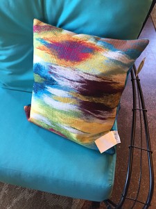
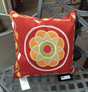
Be bedazzled this upcoming year with vibrant colors that include amethyst, pink, citron and red-orange. These colors will be paired with warm metallic colors such as brass and bronze, colored glass, beading and other gemstone inspired designs.
If a softer palette is more to your taste, then serenity is key this year. Soft pale yellow, blue, pink and green undertones give whites and off-whites a hint of color without being too bold. Think of it as a tinted neutral. Pale blues, dusty greens and grays mix beautifully with whites and creams to create a welcoming and inviting space to come home to. According to Jackie Jordan, director of color-marketing for Sherwin Williams, “We’re seeing this interesting trend of people leaning toward this very light, white, neutral, kind of monochromatic palette. It’s honestly kind of refreshing because I think there is part of us that wants something very sanctuary-like and serene and peaceful, and whites do that very well.” Don’t be scared of white! Fabrics today are more durable than ever and can handle the daily wear and tear of life! Consider a Sunbrella fabric that can be bleached anytime to stay pristine.
If a bolder hue is more your taste, consider going bold with heavy saturated blues, greens and yellows. Many of these colors actually echo back to earlier days when the exterior of homes were often painted bold colors to stand out and as a sign of wealth and prosperity. Bring these colors indoors with bold window treatments, throw pillows and other accessories. Mix these colors with brass accents for the ultimate luxury look. Blues are also bigger than ever this upcoming year. “I actually have eight blues in my 2020 collection, more than I’ve had in any prior year” says Leatrice Eiseman, director of Pantone Color Institute. These blues and greens take their cues from nature and make bold statements in any space. Blues look great in bathrooms since blue is typically associated with water which is a calming, soothing resource itself. Don’t just think that the only shade of blue for your space is “spa” blue. These bold shades can be just as soothing when paired with crisp white.
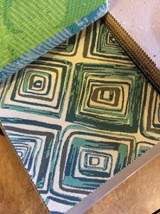
Following along on inspiration from nature, botanical influenced palettes will also have a prominent position in next year’s color schemes. Sherwin Williams 2020 forecast leans more heavily on greens and purples. “We like it because it has floral notes to it, but then also has some neutrals that pair with it really well – a beautiful brown, a gray and then violets, corals, yellows that are just really fresh and can be used in some great combinations,” Jordan said.
So what does all this really mean? In 2020, color is king in a variety of hues, tones and saturations. If committing to the bright fuchsia pink sofa that you see in a magazine is a big leap for you then consider the bright fuchsia pink throw pillow on a neutral sofa instead. Regardless if you want to jump into the color water head first, or just stick a toe in, don’t be afraid to try some color in some capacity. You’ll be amazed at the impact it can make and the ability it has to pull a space together.